Web Store Walkthroughs: Pokemon Go by Niantic
Welcome to the first edition of our Web Store Walkthrough series! Our goal for creating this series is to share the web store expertise of the Appcharge team with the games industry.
With over a decade of combined experience in the trenches of mobile gaming at top companies such as Moon Active, and now building the leading direct-to-consumer web store platform for games publishers, it’s fair to say we know what we’re talking about.
In each article, we’ll analyze a different mobile game web store, and show you what they’re doing well and what could be improved. We’ll unpack:
- The onboarding strategy
- The user experience
- The monetization strategies
- The payment UX
- Social media and community mechanics
Without further ado, let’s jump into our first walkthrough: Pokemon Go by Niantic.
Introduction to Pokemon Go
By far the highest grossing Augmented Reality mobile game, taking under six years to surpass the $6 billion milestone, Pokemon Go has managed to preserve its success since its launch in 2016, being downloaded over 678 million times globally.
Its dedicated web store draws in approximately 2.6 million monthly visitors (according to Semrush data), offering an extended aspect of the game beyond the confines of a smartphone. This high number should not come as a surprise - after all, Pokemon Go drew in 194,000 people to its three real life events in 2023. With that level of community engagement and brand strength, Niantic is in a tremendous position.
Pokemon Go: Web Store Analysis
Onboarding strategy
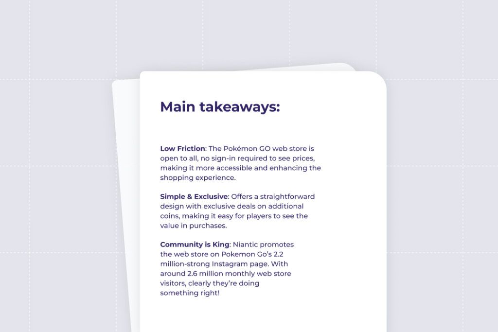
- The store is accessible to everyone through a direct link, displaying deals and prices transparently to both registered users and guests.
- Key navigational elements include two prominent buttons: one for signing in and another for redeeming offers. As players scroll, they encounter various deals, each accompanied by a distinct 'BUY' button.
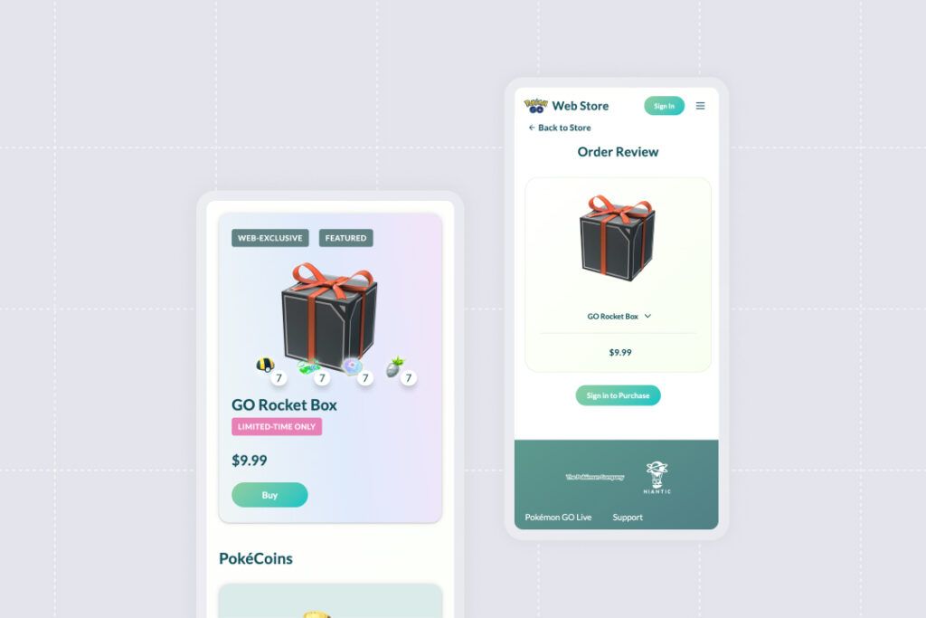
- The user experience introduces a playful twist for guest users. Upon selecting the 'BUY' button, guests are first presented with a full-screen view of the deal before being prompted to sign in. This approach subtly integrates the purchase process into the user journey.
User Experience (UX) Evaluation
First impressions: Design and layout
- The homepage immediately captures attention with an animated Growlithe and in-game items like a straw hat, a red team uniform, an incubator, and a gift box with a purple bow. It shows a clear message to describe the web store: a destination for exclusive deals and extra coins. This straightforward approach contrasts that taken by other publishers, such as Scopely’s web store for Star Trek Fleet Command. Here, it isn’t clearly stated in the header image that this is the place for special deals - in fact, visitors can’t access any deals without logging in.
- The layout is structured to reveal deals only as the user scrolls, ensuring each deal receives dedicated full-screen attention. The simplicity of the presentation - one package per deal with no bundles or extras - ensures a clutter-free and direct user experience.
Navigation: Ease of Finding Key Elements
- Navigation is intuitive and user-friendly. Users are not overwhelmed by options, making it virtually impossible to get lost or confused. The primary choices are straightforward: log in or scroll through the deals.
Call-to-Action (CTA): Effectiveness and Clarity
- The purchase button is prominently displayed in green, standing out clearly for easy and quick transactions.
Design and Gamification
Presentation of the Game: Visuals, Trailers, and Descriptions
- The store maintains a minimalistic approach, with no trailers, flashing lights, or cinematic elements.
Web Store Offers: Visibility and Appeal
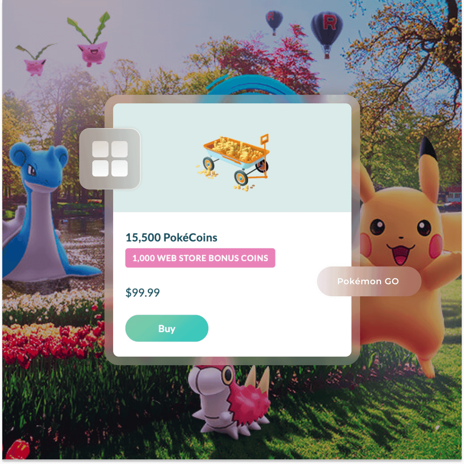
- The deals are presented with clarity, each accorded its own space without additional distractions. The visual scaling of icons based on deal size, from small coin stacks to a cart full of coins for larger purchases, adds an intuitive and appealing element to the purchasing experience.
- Simplicity is at the core of the store's design. Clarity is maintained for each bonus: each deal shows the additional coins players receive for making purchases in the web store: between 6% to 8% extra.
- Interestingly, while the store includes labels like ‘featured’ and ‘web exclusive’, it doesn’t emphasize featured deals, sales, or discounts to the extent often seen in other web stores.
Monetization Strategy
Overview of Purchase Options
The mobile store offers a range of products, including battle pass tickets (purchasable with real cash or PokéCoins), various in-game items, mystery boxes, and free daily bonuses. Towards the end, players find PokéCoin deals, which are also available in the web store. The offerings are aligned with player desires, ensuring relevance and appeal.
Subscription Models
- No permanent battle passes are sold on the web store - although in the past some battle passes were offered.
- No specific mention of subscription models was made, suggesting a focus primarily on individual purchases.
Comparison with Industry Standards
- The store maintains industry-standard pricing, with consistent gradual growth of coin value across different price points.
- The web store bonus however, is more or less the same across all price points
- The maximum coin offer is capped at $100, mirroring common practices in the industry.
Promotions and Discounts
- The web store distinguishes itself by offering bonus coins, a promotion not scaled in proportion with price point increases, but nevertheless maintaining consistent value growth.
Suggestions for improvement
- Continuation of this clear, value-added strategy is recommended, possibly exploring tiered bonuses for higher purchases to further incentivize user spending.
- Gamification mechanics such as daily bonuses and accumulation bars in the store would increase the number of players visiting the store daily and maximize repeat purchases.
Payment User Experience (UX)
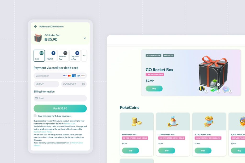
- The payment process in the store is streamlined and efficient. Users are first given the option to use a promo code, directly impacting the final price before proceeding to checkout.
- The checkout process, managed by a professional third-party service, is straightforward and user-friendly. It offers major payment providers, with a focus on platform-specific systems like Apple Pay on iPhones and Google Pay on Android devices. This tailored approach ensures a seamless transaction experience, catering to the varied preferences of users.
Community and Social Integration
Social Media Presence
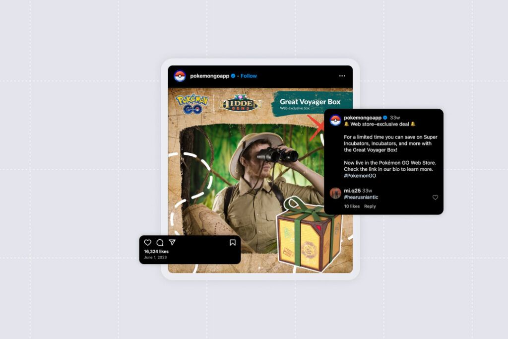
- The web store itself does not directly link to social media accounts. However, exclusive deals are actively promoted through the game's official social media channels, like Instagram. Additionally, these deals are often shared by players in fan groups on platforms like Facebook.
User Forums and Support
- The publisher provides basic text support, but lacks interactive features such as forums, live chat, or a direct community support system within the web store context.
- The absence of interactive support tools or dedicated community forums suggests a limited capacity for addressing user concerns in an engaging, community-oriented manner. This could be an area for potential improvement to enhance user satisfaction and community interaction.
Pokemon Go web store: Final takeaways
Financially, the store seems to be a significant revenue generator. Assuming that half of the store's 2.6 million monthly visitors make a purchase at the minimum price point of $5, it translates to an additional revenue stream of approximately $6.5 million per month, bypassing the typical 30% commission charged by app stores. This indicates the lucrative potential of web stores, underscoring their importance in the overall monetization strategy of mobile games.
In terms of design, Pokemon Go’s web store can be characterized by its clean, minimalistic design which removes potential distractions, its accessible feel with all visitors able to see offers before signing in, and its non-aggressive approach to sales.
We think they do a great job catering to the game's core audience of engaged, experienced players who prefer simplicity and clarity over aggressive marketing tactics. This approach demonstrates a commitment to user satisfaction and loyalty, contributing to the game's sustained success.
In terms of improvements, Niantic could significantly boost engagement, retention, and repeat purchases by integrating gamification elements into the store, such as accumulation bars and daily bonuses.
Follow Appcharge on LinkedIn to stay tuned for our next Web Store Walkthrough.


